Calling all our data nerds and analysts here: are you ready to take your data analysis and visualization skills to the next level?
Today, we focus on Microsoft Power BI, the powerful business intelligence tool that allows you to transform raw data into meaningful insights, organized in beautiful dashboards.
We'll cover the basis of Microsoft Power BI, how to get the data you need for your analysis, how to create visualizations, and how to put them to practical use, like creating time audits and project progression dashboards.
What is Power BI and why should you use it?
Microsoft Power BI is a centralized business intelligence software. With this tool, a user can gather, analyze, and visualize a wide variety of data, and create visual reports, as well as dashboards that can be updated in real-time.
Many data analysts are likely used to the tried and true Microsoft Excel for collecting and analyzing data. But how does Power BI differ? We explain it below.
Power BI VS Microsoft Excel
The main difference between Power BI and Microsoft Excel is the variety of visualizations, as well as the flexibility of Power BI.
Microsoft Power BI offers better connection capabilities compared to Excel, along with a wider range of visualizations, such as charts and graphs. These visualizations also offer better customization options compared to Excel and can be updated in real-time. To create your visualizations, you can get data from a huge variety of sources, not just an Excel sheet (we'll explain more about that in the article).
Use cases: who uses Microsoft Power BI?
Microsoft Power BI is primarily known for its use by business analysts, but in reality, it is designed to be accessible and used by everyone, regardless of their technical expertise.
Whether you are a data nerd, an analyst, a manager, an educator, or a business owner at any stage (from startup to enterprise), Microsoft Power BI empowers you to harness the power of data analysis and visualizations to make informed decisions.
Main Benefits of Power BI
- Create reports from multiple data sources;
- Display reports in visual dashboards;
- Share reports and dashboards with users in and outside your organization;
- Update data, reports, and dashboards in real-time;
- Upload data automatically from multiple sources;
- Customizable and interactive dashboards available;
- Included in the Microsoft suite.
Getting started with Power BI
Microsoft Power BI operates on different platforms:
- A Windows desktop application called Power BI Desktop.
- An online software as a service (SaaS) service called the Power BI service.
- Power BI Mobile apps for Windows, iOS, and Android devices.
Source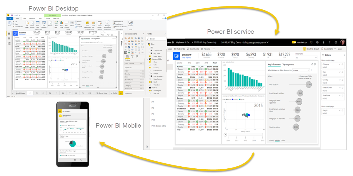
Source: Microsoft.com
The first step is to download and install Power BI Desktop, which is the primary application for creating and publishing reports. Power BI Desktop is available for free and can be downloaded from the Microsoft website.
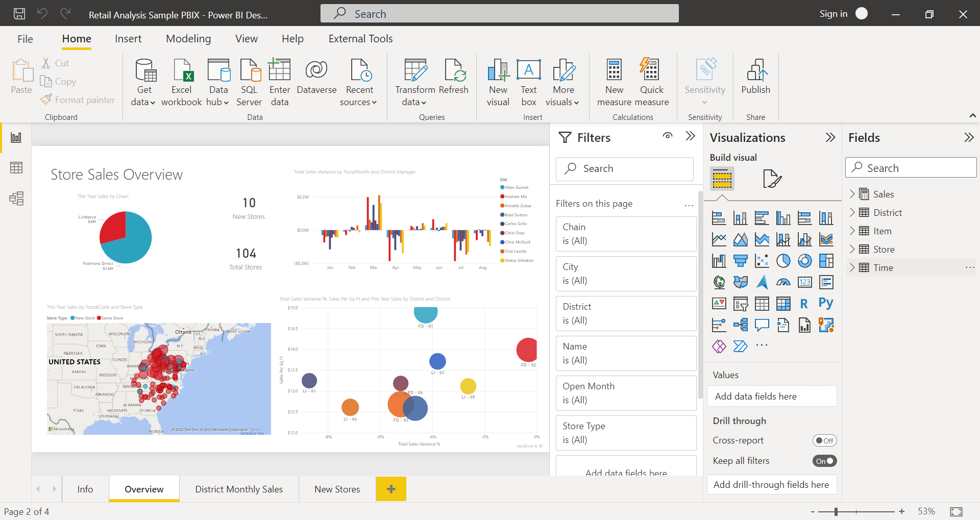
Navigating the Power BI interface
- Reports: a collection of visuals that represent findings and insights from a dataset;
- Visualizations: a.k.a. Visuals, several types of bar charts, pie charts, area charts, and cards used to display data;
- Templates: pre-made models that you can use as inspiration to start working with Power BI
- Fields: tables and folders containing the data you want to present
- Sources: where you get your datasets from
Creating your first report: analyzing data in Power BI
To begin creating your first report in Power BI, start by connecting and importing your data.
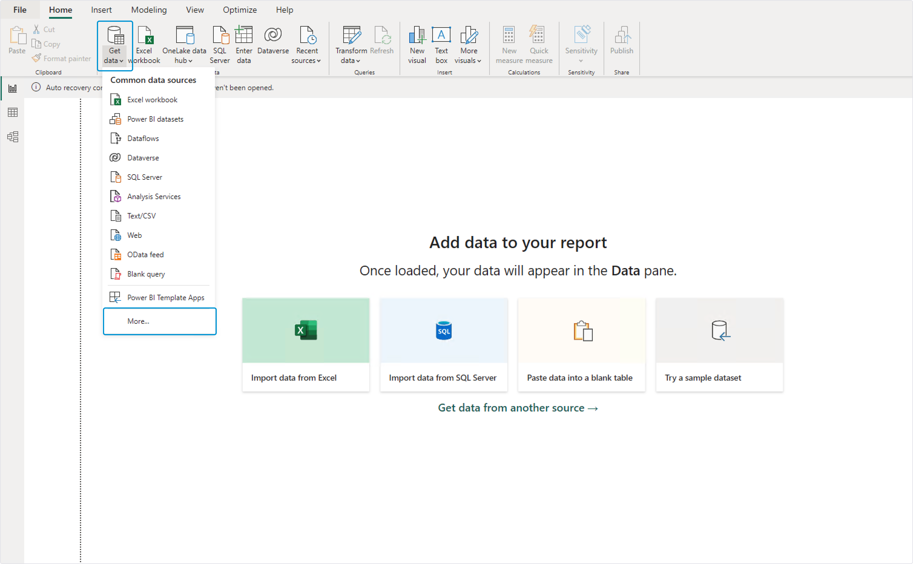
Click the "Get data" button to select your data source.
This action opens a menu offering an extensive array of options, ranging from the familiar Excel sheet to various third-party online servers. One of Power BI's greatest strengths is its ability to seamlessly connect to multiple data sources.
For instance, a sales team manager can bring in data on team performance, evaluate client interactions and deal data from the company's CRM, and integrate this with financial data to assess earnings and profitability.
Back to the reports.
Now that you have selected what data you want to work on, you can start building your report.
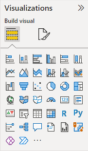
Whether you prefer charts, graphs, or maps, Power BI offers a variety of visualizations to suit your needs. You can choose from basic visuals like bar charts and pie charts, or delve into more advanced options like tree maps and scatter plots.
To craft a new visualization, simply select the chart type that best represents your data with a single click.
Source: Microsoft.com
If you find yourself using the same visual across many reports, you can add the visual to your visualization pane by "pinning" it.
Once you have selected the appropriate visualization, you can customize it to fit your specific requirements. Power BI lets you adjust colors, fonts, and labels to ensure that your report reflects your brand or personal style. You can also add interactive elements like filters and slicers, as well as text boxes, and annotations to provide context and explanation for the data.
Importing data from various sources: Timeneye and time tracking
Timeneye allows you to efficiently monitor and analyze how you and your team spend time on different tasks and projects.
By integrating Timeneye with Microsoft Power BI, you can gather and analyse data on the time spent on specific activities, track project progress, and delve deep into productivity patterns to identify areas of improvments.
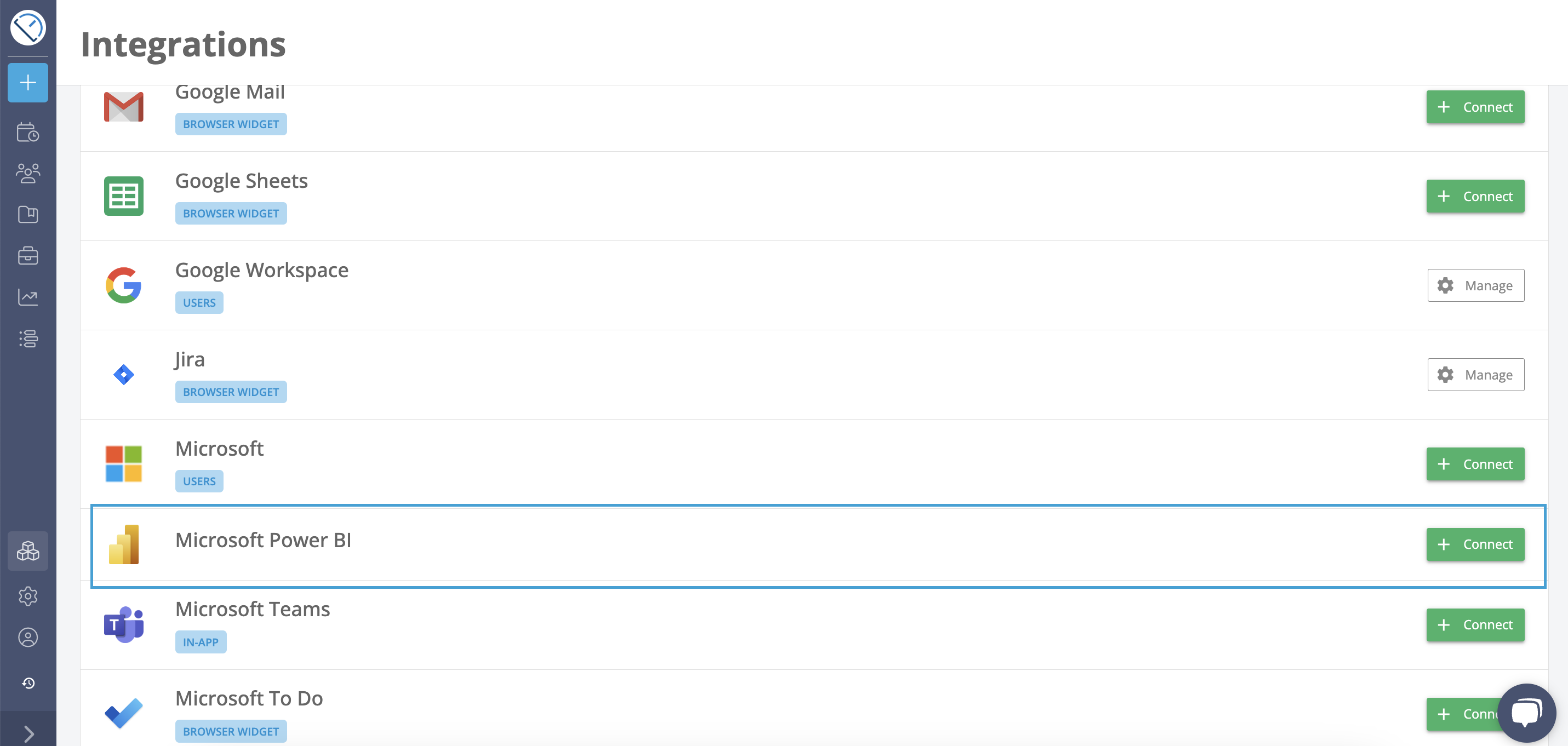
You can set up Timeneye as a data source for Power BI, starting by downloading a connect file.
You can do this from the Timeneye Integrations section:
After you have followed this procedure, you'll be able to select Timeneye as a data source for creating visual dashboards on Power BI.
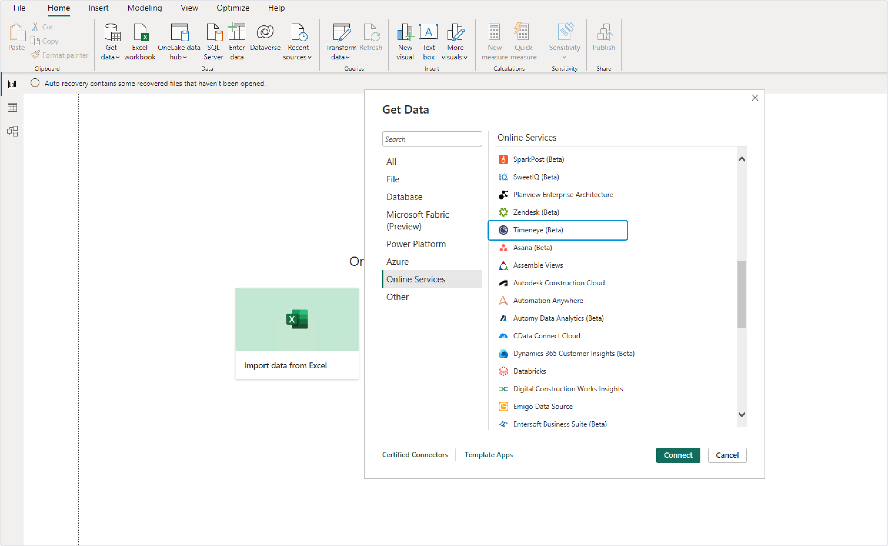
In Microsoft Power BI, click the "Get data" button, and then scroll down to find the "More "option.
In "Online services", you'll find Timeneye.
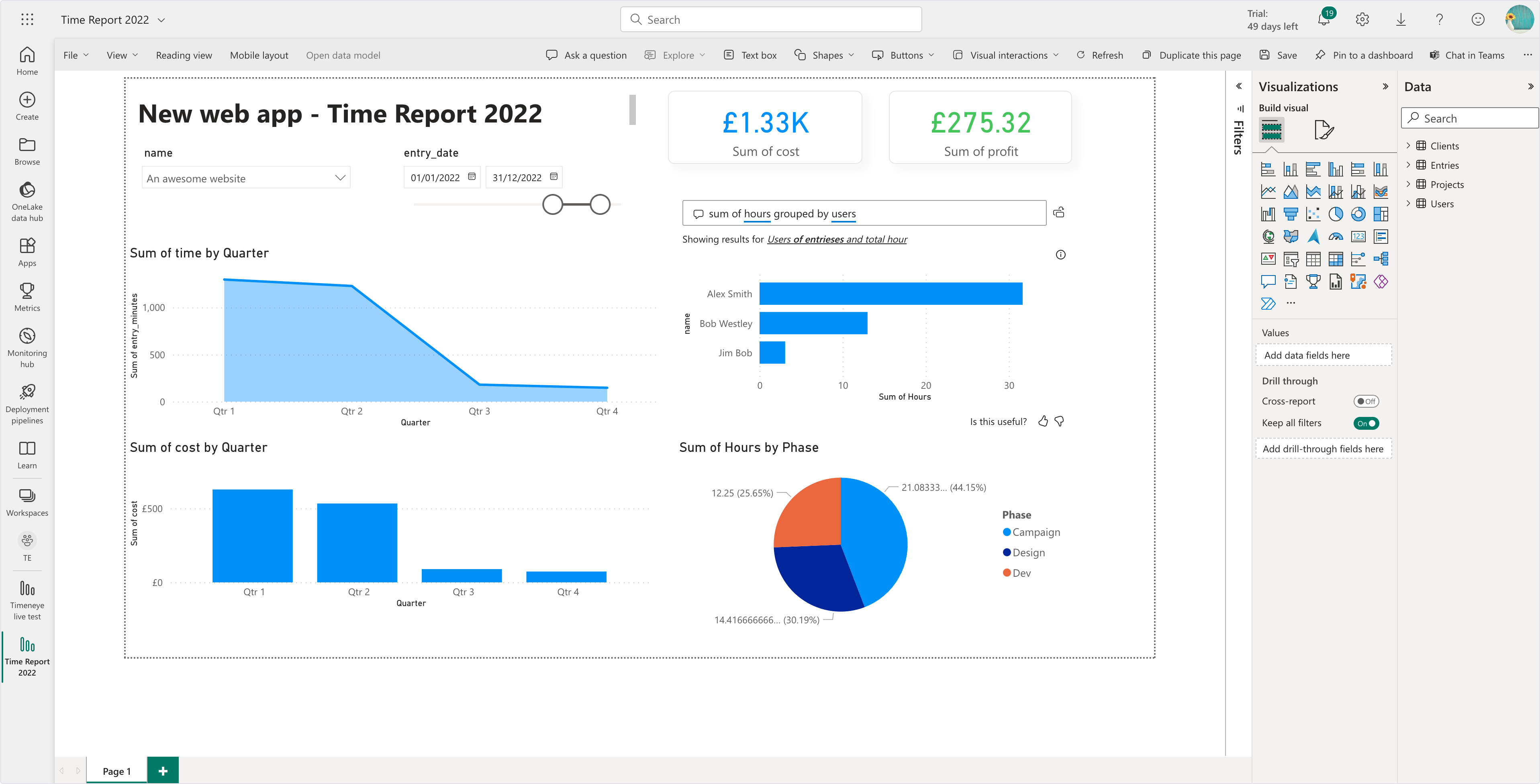
For instance, take a look at this report showcasing various visualizations that illustrate a project's quarterly progress:
Sharing and collaborating with Power BI
Once you have created visualizations and analyzed your data in Power BI, you can share your findings with others. Power BI offers several options for sharing and collaborating on reports and dashboards.
One option is to publish your reports to the Power BI service, which allows others to access and interact with your reports online. You can also share reports directly with specific individuals or groups by granting them access to the report.
Power BI also offers collaboration features that allow multiple users to work together on a report or dashboard. For example, you can invite others to join your workspace and collaborate on a report in real time.
Comments can be added to an entire dashboard, individual visuals on a dashboard, a report page, a paginated report, and individual visuals on a report page.
Power BI best practices and tips for beginners
- Keep the data simple and clean;
- Avoid clunky spreadsheets: you can edit the spreadsheets to better fit your analysis before building the reports;
- Combine different visualizations and cards for maximum clarity;
- Make use of colors and text to make order in the reports;
- Refresh the data automatically to update the reports in real time.
If you wish to hone your Power BI skills, Microsoft offers official training courses and certifications for Power BI, covering a range of use cases. They also provide online resources to help you get started and explore all of its features, starting from the Power BI YouTube channel.
Conclusion
This guide barely scratched the surface of what Microsoft Power BI can do in terms of data visualization.
Overall, Power BI transforms raw data into insights, offering a wide range of visualizations and customization options. Accessible to all, it empowers users to make data-driven decisions. It's definitely a powerful software for those who want to take data analysis to the next level.
Are you ready to analyze your team's productivity? Get started today!
